Even if we get past the image, there's still the design of the band name to deal with.

9. Three-way tie: Guided by Voices - Bee Thousand, Alien Lanes, and Propeller
Turns out "lo-fi" isn't such a great idea when it comes to album art.


8. Tortoise - TNT
You know what they were going for, but it doesn't make it any more forgiveable.

7. Neko Case - Fox Confessor Brings the Flood
Even after you determine that the big black space isn't her hair, there's still no accounting for the weird pink margin.
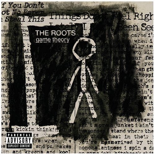
6. The Roots - Game Theory
This is exactly why you don't come up with album cover concepts while high.

5. Hieroglyphics - Third Eye Vision
Cool font!

4. The Police - Outlandos D'Amour
Did Sting really need to be prettier?

3. Black Sabbath - Paranoid
Is anything about this done well?

2. Smashing Pumpkins - Gish
Have you ever been in a group photo where you look terrible and everyone else looks normal? The Smashing Pumpkins managed to get a photo where each of them looks the worst they have ever looked. Then they put it on their debut album.

1. Alice in Chains - Facelift
I had to fudge a little with this one, because I can't say it's a good album, or even that I've heard more than a couple songs, but I mean, holy crap.

Bonus: Broken Social Scene - You Forgot it in People (alternate cover)
This complete turd makes me even angrier because I can't get iTunes to use the much cooler real album cover.

Extra bonus: Radiohead - Pablo Honey
No, you're right, it's not a good album. But by comparison, the music's great.


I do not agree with #7. It's not award winning but it doesn't deserve this list! And if you don't think I have the authority to make such a claim, let's all just remember I have a MINOR in graphic design. Yeah.
ReplyDeleteAlice in Chains could use real turds as their album covers and it still wouldn't be as bad as their music.
ReplyDelete